This post is part of the Getting Started with Plug-ins Pro APEX plug-ins series.
Charts and visualizations become very important when talking about data. Businesses are using these visualizations to make an appealing story. You will find many tips and tricks on the internet when you search for Data Storytelling. One of the most important tips is to use the right chart for your data.
So as a developer, will you figure out what type of chart to include in your Oracle APEX app?
Or do you include a complete dashboard with every possible way to look at the data?
The issue is that the perfect chart depends on the story the business wants to tell!
Let's look at an example of that is pertinent to today: COVID data.
The table below shows the number of positive cases in the last 4 months for two different countries and a total.
Most likely, people would like to look at this data where the months go from left to right, so let's pivot the data:
How do we visualize this data?
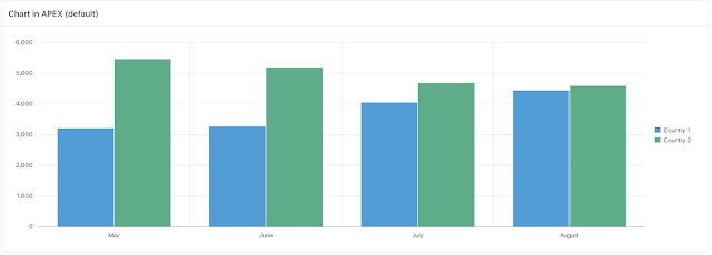
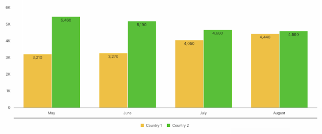
If I add a Chart region in APEX, providing the data source, adding sorting and a Legend, it looks like this:
We can now customize the chart further, but without knowing what the business wants to talk about, it's hard, no? We can use different colors, move the legend to the bottom, change the bars to be stacked, use a different chart type, etc..
When you look at the history of Oracle APEX, one of the most significant and breathtaking features has been Interactive Reports. As a developer, we specify just the SQL query, but the business user is able to look at the data in different ways.
With United Codes, we wanted to provide the developer and business user the same functionality as the Interactive Report but with charts. So I'm happy to introduce you to one of the most astonishing Plug-ins Pro APEX plug-ins: Interactive JET Charts Pro.
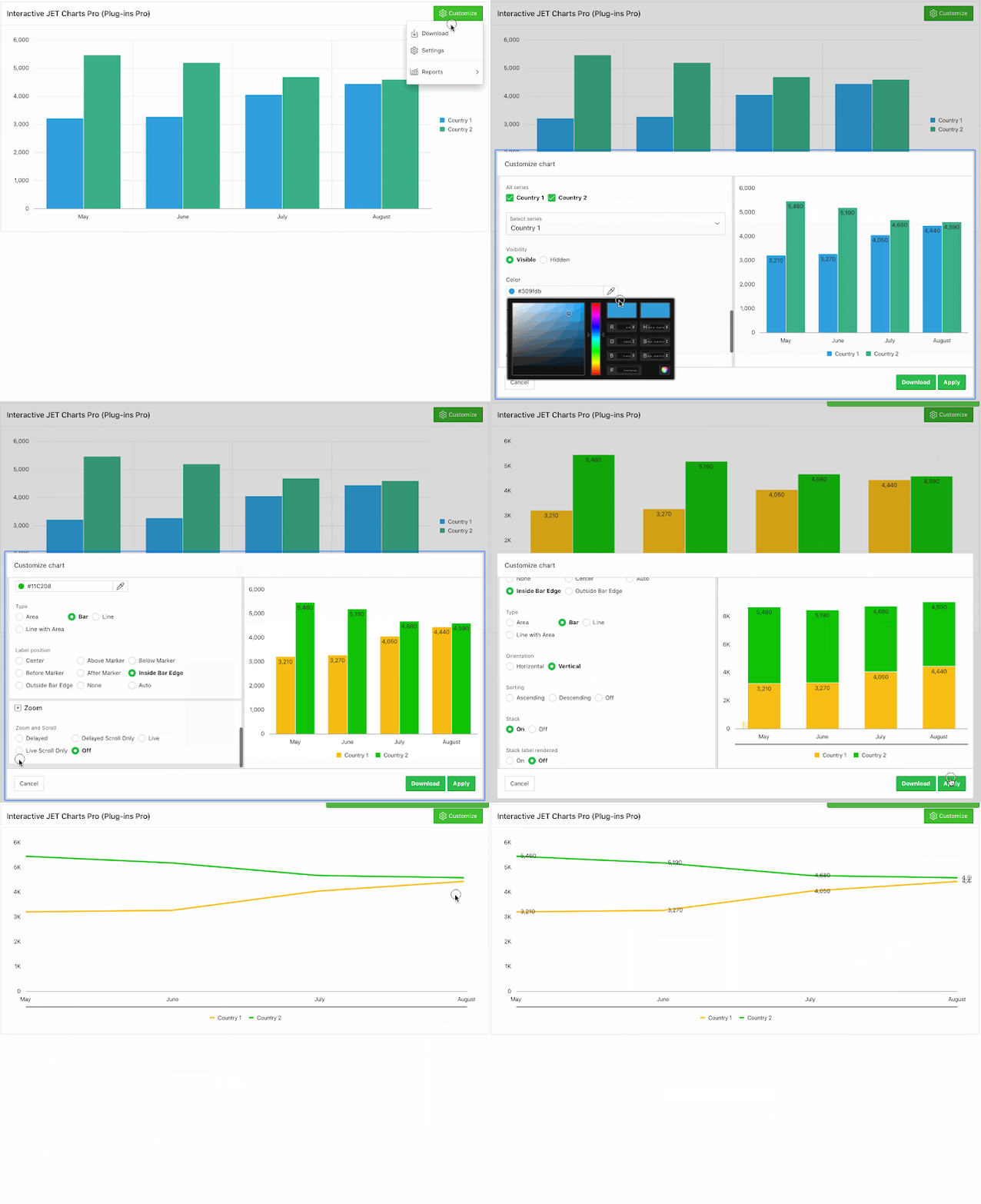
Let's look at what this plug-in can bring to your end-users:
Did you see
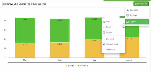
your end-users can save the customized charts, just like with Interactive Reports? They can add as many charts as they want, so they can
quickly change to different views and even share those charts with colleagues!
Mindblowing? Well, it was for me when I saw how far we got with this 😀
Before I show you how to add a customize button to your own charts, I want to continue the data story...
All of the charts I created in the animated gif are on the same data, but they all support a different story.
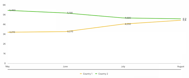
The line chart shows whether lines are going up, going down, or holding steady. You can clearly see that country 2 numbers decline and country 1’s take an upswing.
The clustered column chart directly compares the two columns. This is perfect when I want to focus on the difference between both countries: the orange column vs the green column. I changed the colors of the charts as they better represent the country and the difference is shown more clearly.
The stacked column chart focuses on part-to-whole patterns, how the gold segment and the green segment add up to a total. If I wanted to tell the story about the combined numbers of the countries I would pick the stacked bar chart.
So which one to pick, it all depends on the message you want to get across. The Interactive JET Chart APEX Plug-in is ideal if you need to brainstorm on several possible charts, to finally find the perfect chart to support your message. And the cool thing is that as a developer you don't have to make decisions about which type will be most suitable, you give the power to the end-user!
Ok, now that we have a bit more background as to why we built this plug-in, let me walk you through step-by-step how to get started in your own app.
One point of attention, in the last step, when you install the plug-in it will prompt the Component Settings and you have to define which Procedure you want to use to save the charts. This plug-in will save the end-user settings in a table.
I would recommend installing the Sample App that comes with the plug-in. This will install everything you need.
The procedure is called UC_JET_CHART_API.SAVEREPORT. You can look at that package and can customize it to your needs. As you have full control over the procedures to save, fetch, and delete charts, you can hook up authorization schemes or any rules you like.
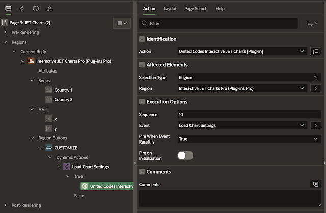
In your application, go to a page where you have a JET Chart. Add a Button, right-click on it and add a Dynamic Action that fires on Click of the button. As Action, you specify United Codes Interactive JET Charts [Plug-in] and you select in Affected Elements the JET Chart Region.
That's it!
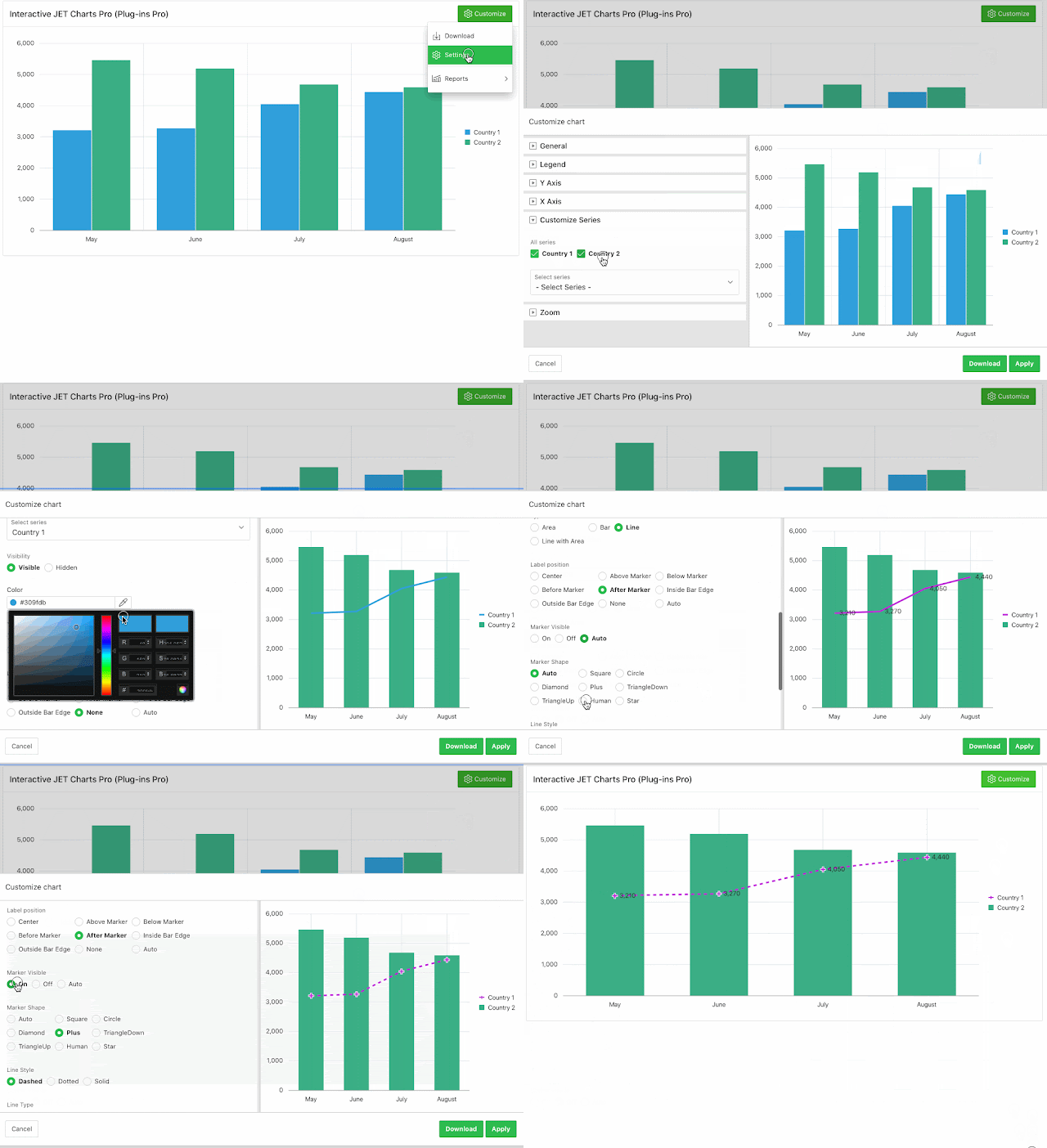
In the animated gif, I only did a few customizations, but there are so many more things in this plug-in! In the next example I hide and show a series, so you can focus on a single data set and I change a series chart type and color.
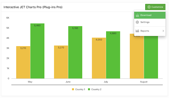
Another important feature is that you can download the JET chart you customized to a PNG file.
This way it's super easy to include the chart in a presentation or document.
Finally, just like any other
Plug-ins Pro plug-in, there's extensive
documentation and a great
sample app that showcases the different features. I would strongly encourage you to look at the
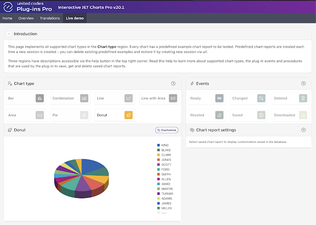
Live Demo in the sample app. The plug-in exposes many events, something I didn't even touch on in this blog post!
You can try the plug-in yourself for 1 month for free in your own APEX applications, so you can see what it can do for you. I also want to highlight that through the end of September 2020, there's a special running. You can find all the details on the
Plug-ins Pro website!
I'm a big fan of charts and visualizations and I believe your end-users will love this plug-in!
In 2008 I did a chart presentation at Kscope and I joked that using charts in your Oracle APEX apps is the shortest way to get a raise (as every manager loves pretty pictures). Our goal is to make you even more successful by providing you extra tools, if this plug-in also gives you a raise, it makes us full of joy. We wish for your success (and raises) 😀
Author: Dimitri Gielis
View original post here.


